


With a milquetoast green and off white motif, I suggested bringing more of the Brockport colors and “Brand” to this facility.
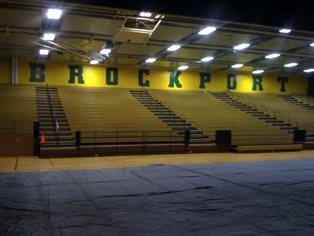
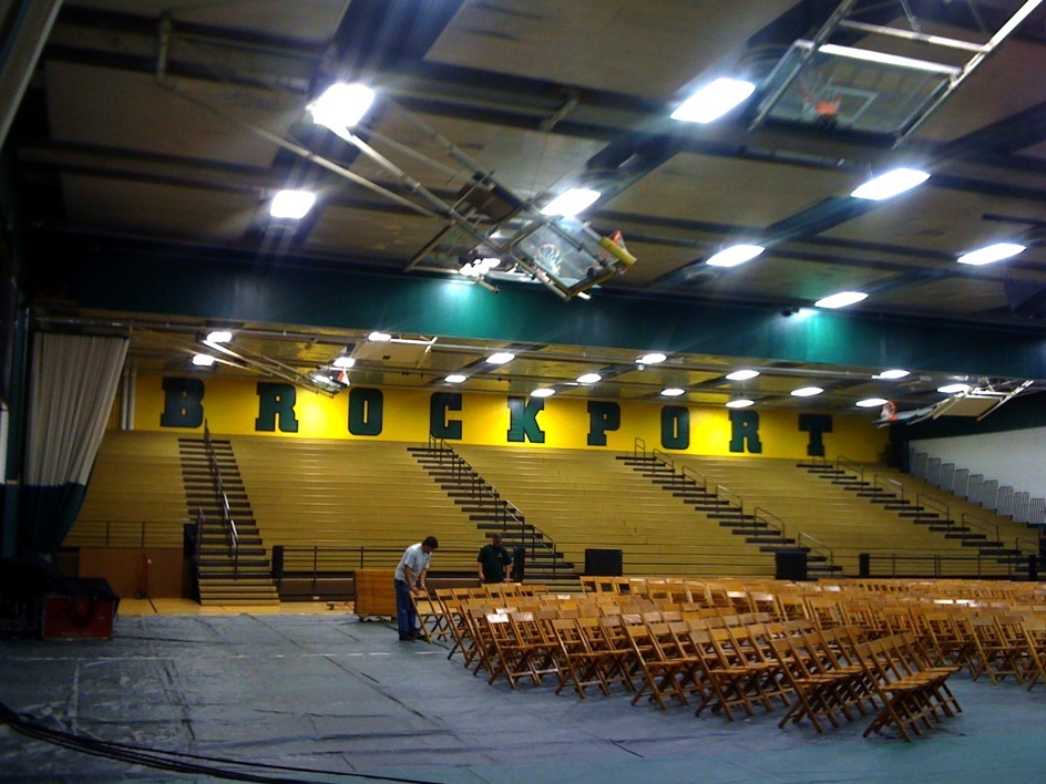
Before
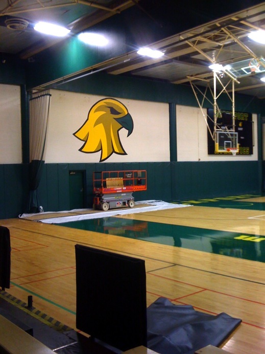
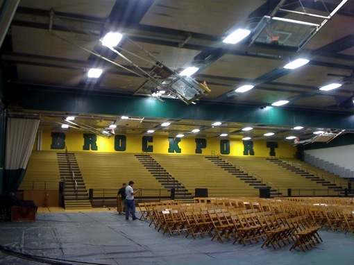
After
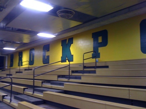
I strongly suggested paint on these walls for the following reason:
1: If it’s within reach of the students at a college campus, it is entirely likely that the student’s rooms will be full of the vinyl logos the university just spent thousands on to “Brand” the facilities. Furthermore, if the painted logo is defaced it can be easily touched up, vinyl letters and images can be ripped, peeled off in part or in total, scratched scraped and gouged. Once that happens they have to be replaced, it’s almost impossible to repair them in a sightly manner.
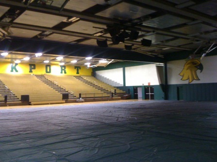
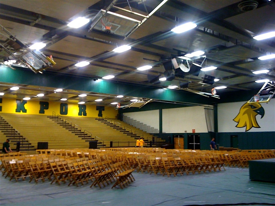
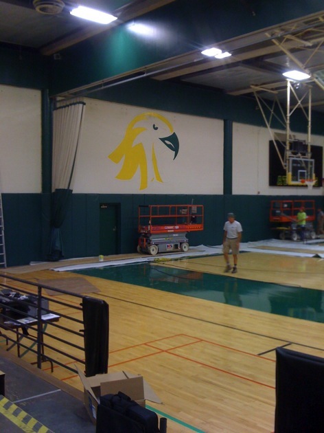
Here’s a few more gratuitous pics from the College at Brockport gymnasium in different stages of artist, Gregory Nowak, branding this facility.
In July 2011, I was called by the athletic directors of the College at Brockport. They asked me to “Brand” certain athletic facilities at the College at Brockport. With an established logo to work with, and a custom type face, the transformation has been dramatic. What once was an asylum motif of grey block is now a facility truly representing collegiate pride. To see transformations to Tuttle North Ice Arena click here. To see the gymnastics arena transformation click here.
The Change has been so dramatic, in the first six seconds of this new commercial for the College @ Brockport, the work I have done branding the gym is featured !


To see how the changes have dramatically enhanced the photographic quality of the events, click here for BEFORE the changes. And AFTER the “Branding changes” click here. IT’S SHOCKING. The awesome backdrop that is provided by the new Branding of this Facility at The College at Brockport, has completely changed the photographic approach to these events. It doesn’t even look like the same venue.